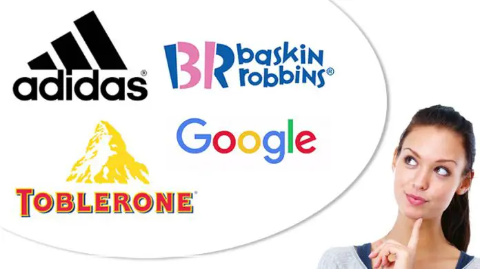
Unless you have been living in a cave all this while, you definitely have seen some of these famous logos before. These logos are not only familiar to our subconscious minds, but they actually also carry significant meanings of their own. Read on as we uncover the 15 Hidden Meanings Behind These Famous Logos below.
1) Adidas
The famous three-striped logo that appears above the word “adidas” was designed to resemble the shape of a mountain. It also signifies the challenges and obstacles that athletes would endure.

2) Amazon
Amazon needs no introduction. This world-famous online retailer sells basically every essential from accessories and books to computers and watches. It doesn’t take a genius to figure out the meaning behind their minimalist logo. The most obvious one is the yellow curved arrow, which clearly represents a smile that makes the customers happy when they shop online at Amazon. Also, take note at the arrow that starts from “a” to “z”, which brings us the second meaning: this online retailer has it all when comes to product inventory from A to Z.
3) Apple
The partially-bitten “Apple” logo has a few meanings. One of them has to do with the story of Adam and Eve where they took a bite into a fruit — presumably an apple — from the Tree of Knowledge. But the truth is, Rob Janoff — the designer of the Apple logo — added the “bite” for a “scale” purpose to ensure that consumers would not be mistaken it as a cherry but an apple instead.

4) Baskin Robbins
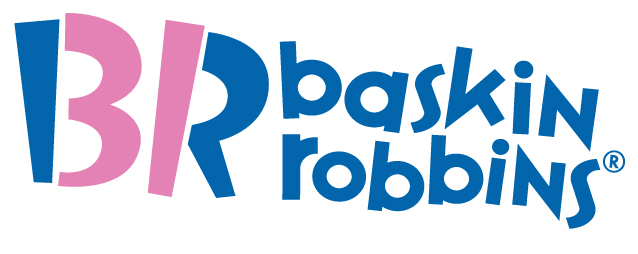
Look closely at their logo below. See the pink colour of the letters “B” and “R”? Well, true to their company’s slogan, the “B” and “R” also cleverly doubles as the famous numbers that represent “31” flavours of ice cream.
5) Beats
As simple as it looks, the “Beats” logo actually represents a human’s head (the round shape in red) while the letter “b” is a headphone. Smart, don’t you think?

6) Burger King
Mention the word “Burger King”, the first thing that often comes to mind is their signature beefy goodness of their “Whopper” burger. Their logo carries two meanings: the words “Burger King” that is sandwiched between the two golden buns indicate they are the “king of hamburgers” (or “burgers” for us Malaysians here). See the blue circle that covers the “Burger King” logo? Well, the colour itself represents appetite as well as attracting customers of all ages at the same time.

7) Coca-Cola
Here’s a little trivia: Did you know that the world-famous “Coca-Cola” logo was not created by a designer but actually a bookkeeper named Frank Mason Robinson? The meaning behind the logo is simple but effective enough: the script font represents the classic handwriting made famous during its time in 1886. Even after more than 130 years since Coca-Cola was first introduced, their brand integrity remains intact to its famous logo’s classic style.
8) FedEx
No doubt the “FedEx” logo looks simple enough. But if you pay close attention, you will find a white arrow hidden within the “E” and “x”. That arrow is meant to represent speed and precision associated with their courier service.
9) Gillette
The otherwise simple-looking logo of Gillette hides its own significant meanings. First, the letters “G” and “i” are made to look like they have been partially sliced with a sharp razor. The italic font of the “Gillette” word indicates speed and precision associated with their razor products.

10) Google
The current “Google” logo, which uses the sans-serif typeface, represents modernity and a playful vibe associated with their company’s motto. The logo also combines largely primary colours of blue, red and yellow with a random secondary colour of green. This is actually a form of expression that the company prefers to have fun by breaking the rules.
/cdn.vox-cdn.com/uploads/chorus_image/image/47070706/google2.0.0.jpg)
11) LG
LG stands for “Lucky Goldstar” and is also associated with the company’s famous tagline — “Life’s Good”. As for the round logo itself, the “L” actually represents a nose while the “G” signifies a face. The overall design is meant to signify humanity, technology and future.

12) McDonald’s
Ever wonder why McDonald’s and its famous golden arches are coloured in red and yellow? Apparently, the red colour stimulates appetite while the yellow symbolises happiness and visibility, which can be easily seen regardless of daylight or nighttime. Not to mention red and yellow are two bright colours that offer two psychological reasons: making you hungry and driving you to purchase their burger set.
13) Nike
The iconic Nike symbol or better known as “swoosh” actually refers to a Greek goddess that symbolises victory. The logo also represents movement and speed — two words that are in line with the company’s major selling points of offering lifestyle and sports shoes.
14) Toblerone
Toblerone is no doubt one of the most recognisable chocolate bar brands since its introduction in 1908. Their famous logo of a mountain actually symbolises the Matterhorn Mountain in Switzerland. And if you look closer, there is a hidden white bear within the mountain — a reference to the “City of Bears” a.k.a. the Swiss city of Bern where the chocolate was originally founded.

15) Toyota
The “Toyota” logo represents two meanings: the first one that has three overlapped rings represents the unification between their products and customers. Interestingly enough, the logo itself is actually a combination of five letters merged together. The five letters in question are none other than “T-o-y-o-t-a”.
