The Internet is leading to many brands modifying their logos as a way to appeal to an online audience. And while we have seen Yahoo, Google, and Facebook go down this path, we never expected BMW to join them. After all, BMW is not an online business. Yet the automobile brand is indeed introducing a new logo! This is the biggest change to the brand in over 20 years.
BMW Introduces a New Logo
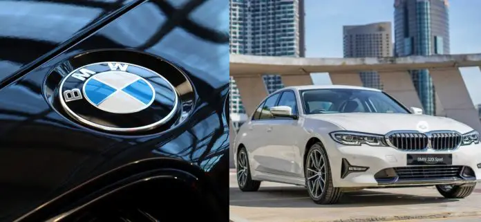
Currently, BMW has quite a distinctive logo with it’s blue and white poker chip resembling inner circle. This is then surrounded by a black ring with the initials BMW in a bold white font.
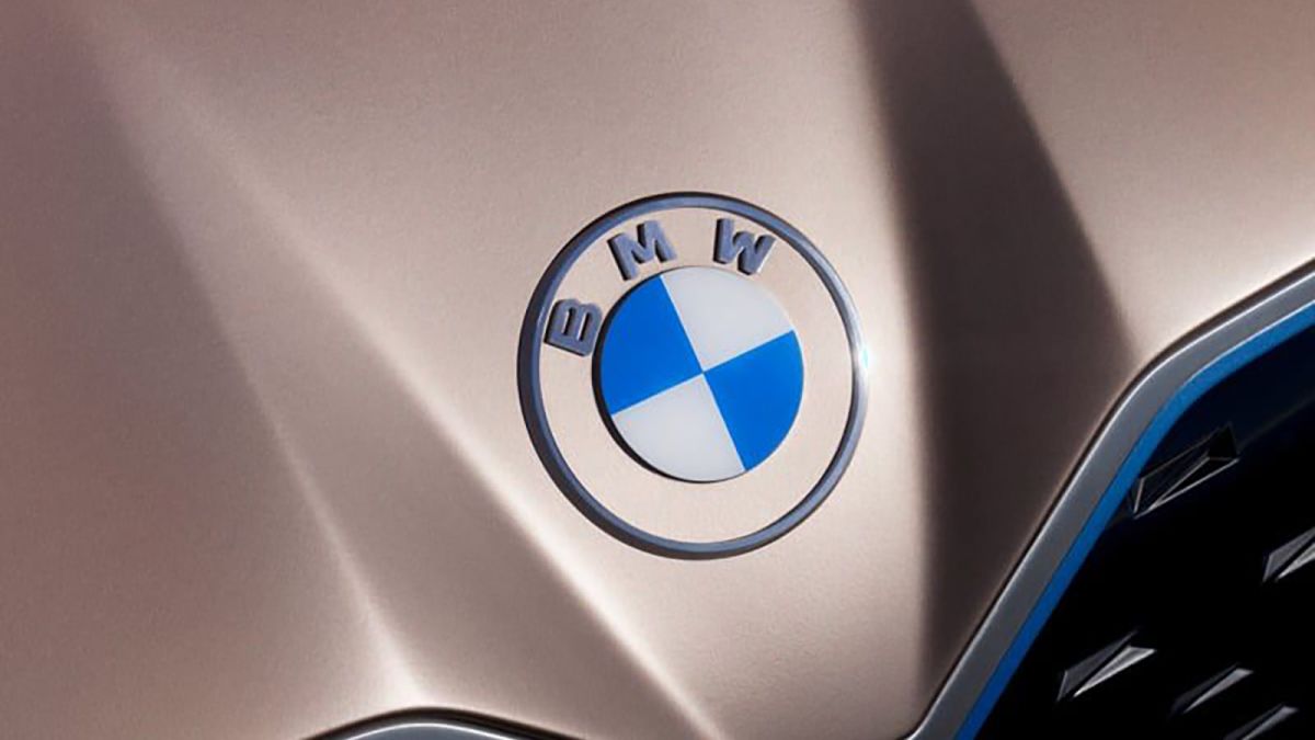
Now in their latest move, BMW is introducing a new flat logo that they claim is better-suited to the digital age. Firstly, it no longer uses any 3D effects such as shadows and highlights. Instead, it is a flat lay version that is pretty nice to look at.

However, BMW has also removed the outer black ring and is leaving a transparent border. According to Jens Thiemer, senior vice president for customer and brand, the transparent version invites customers to be part of the world of BMW.
In addition, the new design prepares the brand for challenges and opportunities for digitalisation. Thanks to graphic flexibility, BMW is now equipped for a variety of touch points in communication. This includes online, offline, and whatever the future holds.
The new logo is not replacing the current logo that features the black ring. Instead, the two will co-exist as the logos of the company.
Mixed Opinions
/cdn.vox-cdn.com/uploads/chorus_image/image/66439957/aDzH7sHpSJ9ivMQhPMiwT5_1024_80.0.jpg)
Unfortunately, the new logo has garnered a lot of mixed reviews. Some are applauding the new minimalist and aesthetically pleasing look. Meanwhile, others are pointing out that it’s a lot more difficult to look at.
That’s because with the new transparent background and the same white font, it’s a lot harder to see. Most computers will still have a plain white background as a default. This means that the white lettering is harder to spot.
What do you think? Is it a good move for them to change their logo? Furthermore, did they even do it well enough to warrant the change.


